
When a DIY brand that millions of French people visit each month changes its visual identity, the change is not limited to a simple graphic facelift. The new Castorama 2026 logo marks a turning point in the brand’s strategy, aligned with the end of the “Responsible Business” plan from its parent company Kingfisher and new expectations for sustainable consumption.
End of the Kingfisher 2021-2026 Cycle: What the Logo Represents Behind the Scenes
Most analyses focus on colors or typography. However, the strategic context deserves attention. Castorama belongs to the British group Kingfisher, which has led a program called “Responsible Business” from 2021 to 2026.
This program set specific goals: reducing carbon emissions (Scope 1 and 2), increasing the share of sustainable products in catalogs, and generalizing the use of wood and paper from responsible sources. According to the Kingfisher report published in August 2026, the majority of these goals have been achieved or exceeded.
The logo change occurs precisely at the juncture between this completed cycle and the group’s new roadmap. This is not a coincidence of timing. Castorama’s image in France must now embody the commitments of the next phase, the details of which are yet to be publicly defined.
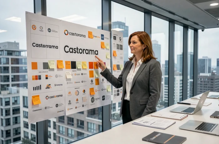
By analyzing the Castorama 2026 logo, we understand that each graphic choice reflects this transition between a positive CSR assessment and a renewed promise to customers.
Castorama and Water: A Visual Commitment That Masks a Weakness
Have you noticed that Castorama’s new communication emphasizes water savings? This positioning is not trivial. An independent sustainability score (SINK) gives Kingfisher a solid rating on controversies and operational carbon footprint, but a significantly lower score on the “Water impact” dimension.
In other words, the group knows that water is its weak link in environmental assessment. The choice to place this theme at the heart of the new brand identity is therefore a direct response to this weakness identified by third-party evaluators.
This strategy follows a well-known pattern in rebranding: transforming a vulnerability into a communication axis. It works as long as the products and advice offered in-store genuinely follow suit. Castorama has been developing ranges focused on water recovery and water-saving equipment for several months, providing a concrete foundation for this discourse.
New Castorama Logo: Technical Reading of the Design
Why do some DIY brands retain massive logos while others opt for sleek lines? The answer lies in one word: readability on screen.
Adaptation to Digital Media
The new logo has been designed to work equally well on a smartphone and on a store facade. The shapes are simplified, and the colors are reduced. A logo designed first for digital, then for physical, which reverses Castorama’s historical logic.
This approach aligns with Castorama’s strategy on the Amazon marketplace, recently integrated into its omnichannel strategy. The logo must be identifiable in miniature, in a product feed, or a mobile application.
Color Choices and Brand Consistency
The chosen colors are part of a palette that evokes both gardening and construction. The brand seeks to recall its two historical universes without favoring one over the other. The new graphic identity aims for three simultaneous objectives:
- Enhance instant brand recognition in a saturated environment (apps, social media, search results)
- Visually convey the group’s responsible commitment, echoing Kingfisher’s reports
- Support the modernization of physical stores, several of which were fully renovated in 2024 and 2025 (La Seyne-sur-Mer, Melun)
Store Modernization and Consistency with the New Image
A logo does not exist in isolation. Castorama announced an ambitious renovation plan for its store network in March 2024. The goal: simplify the customer journey and adapt spaces to new shopping habits.
The La Seyne-sur-Mer store underwent a complete transformation. The Melun store reduced its space while improving the in-store experience. These renovations were carried out while the stores remained open, which represents a considerable logistical challenge.
Interior signage, uniforms, in-store advisory materials: everything must gradually integrate the new graphic charter. This rollout spans several months and affects the approximately 94 stores in the network across France.
The Role of the Green Star Marker
Alongside the logo, Castorama continues to deploy its Green Star marker, a pictogram that identifies the most virtuous products in the catalog. This marking system complements the new visual identity. It allows customers to make informed choices without reading a complete technical sheet.
The link between the logo and Green Star is strategic: both visual elements contribute to a committed communication around sustainability, with different levels of interpretation (overall brand on one side, individual product on the other).
What This Rebranding Says About the DIY Market in France
The DIY superstore sector in France is undergoing a period of consolidation. Brands are investing heavily in digital, delivery, and personalized advice. Castorama’s logo change fits into this broader movement.
Several brands in the sector have also revised their identities in recent years. The common trend: more understated lines, visible environmental commitments, and an increasing focus on energy renovation projects.
- The DIY market in France remains a multi-billion euro annual revenue sector, driven by the renovation of the aging housing stock
- Customers now expect comprehensive support (advice, financing, installation), not just a product catalog
- The omnichannel strategy (store, website, marketplace) is becoming a standard, and the logo must work across all these channels
The new Castorama logo is not a mere stylistic exercise. It materializes a complete repositioning, from environmental promise to customer relationship in-store. The true measure of its success will be seen on the shelves, when the teams and products genuinely embody the values that this logo promises.